C L I E N T
Oothes
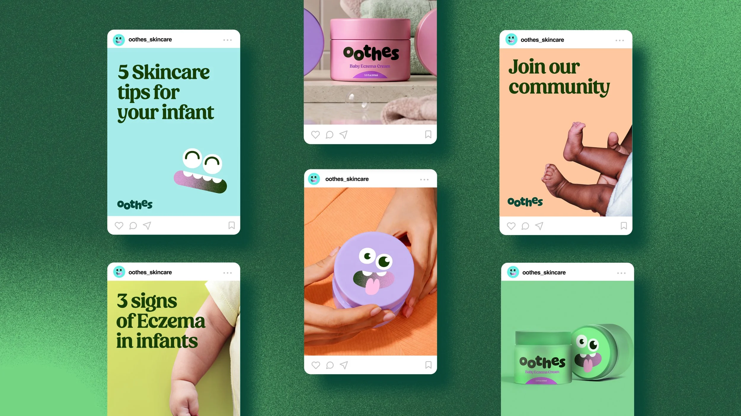
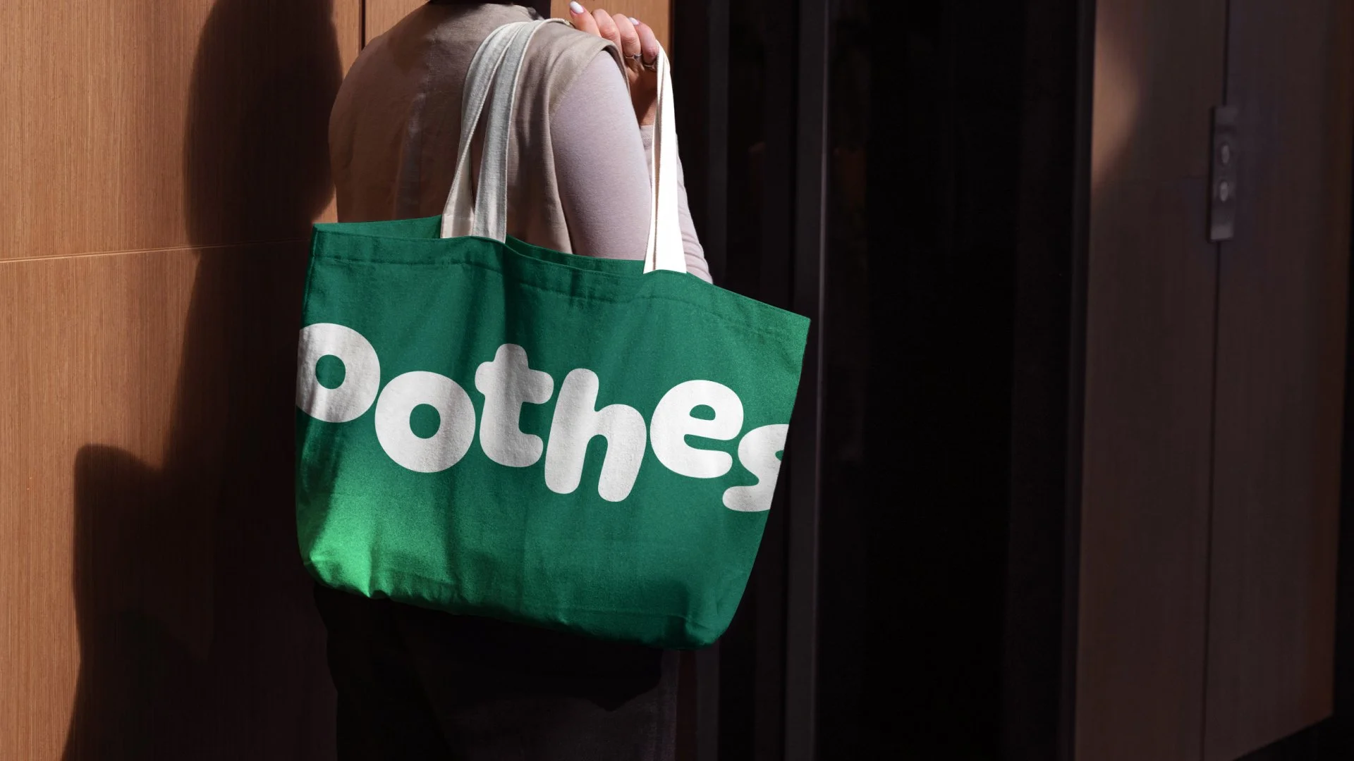
→ Brand Identity
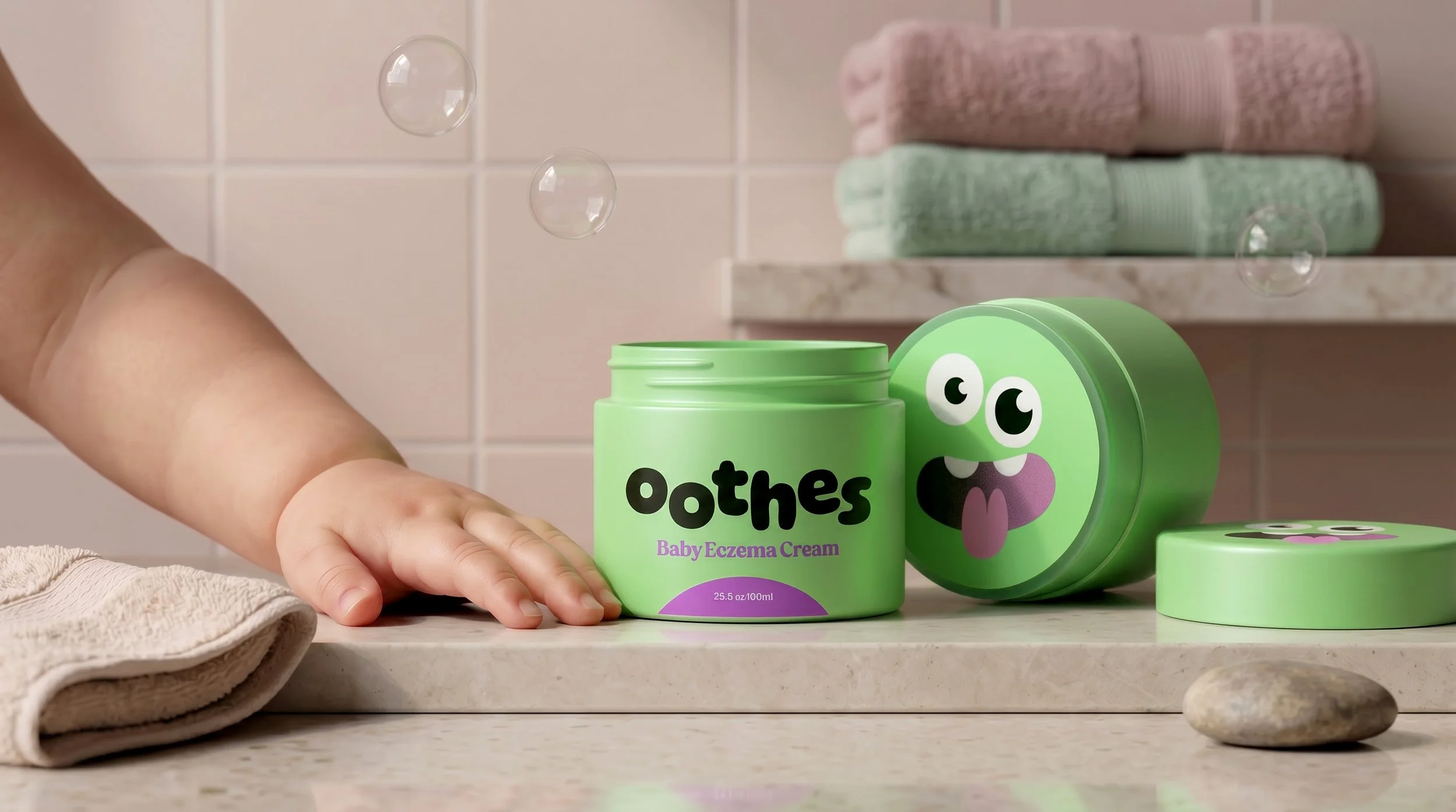
→ Packaging
→ Animation
T H E C H A L L E N G E
Oothes is a heartfelt and innovative skincare brand created to support children with sensitive skin. Inspired by the personal experiences of its founders, the brand was built around a simple mission: to create effective, clean skincare solutions that feel approachable, enjoyable, and empowering for children and their families.
The challenge was to develop a brand identity that balanced trust with a playful, positive experience - making skincare feel less clinical and transforming a daily routine into a moment of fun.
T H E S O L U T I O N
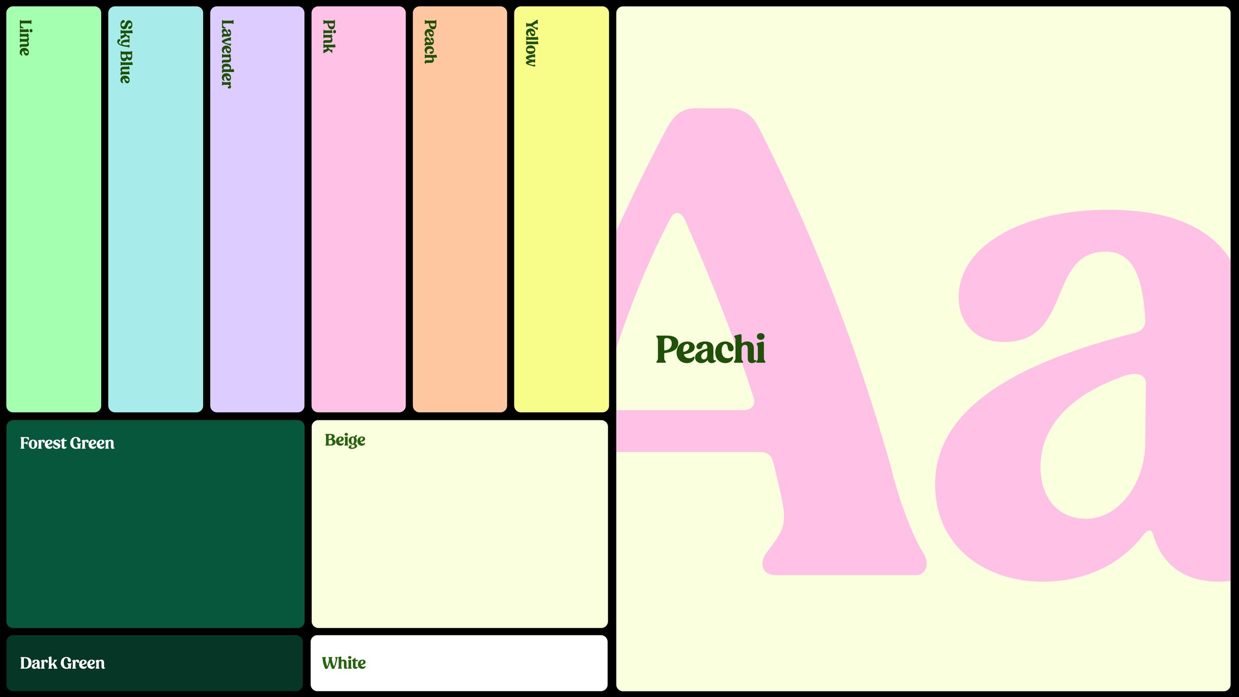
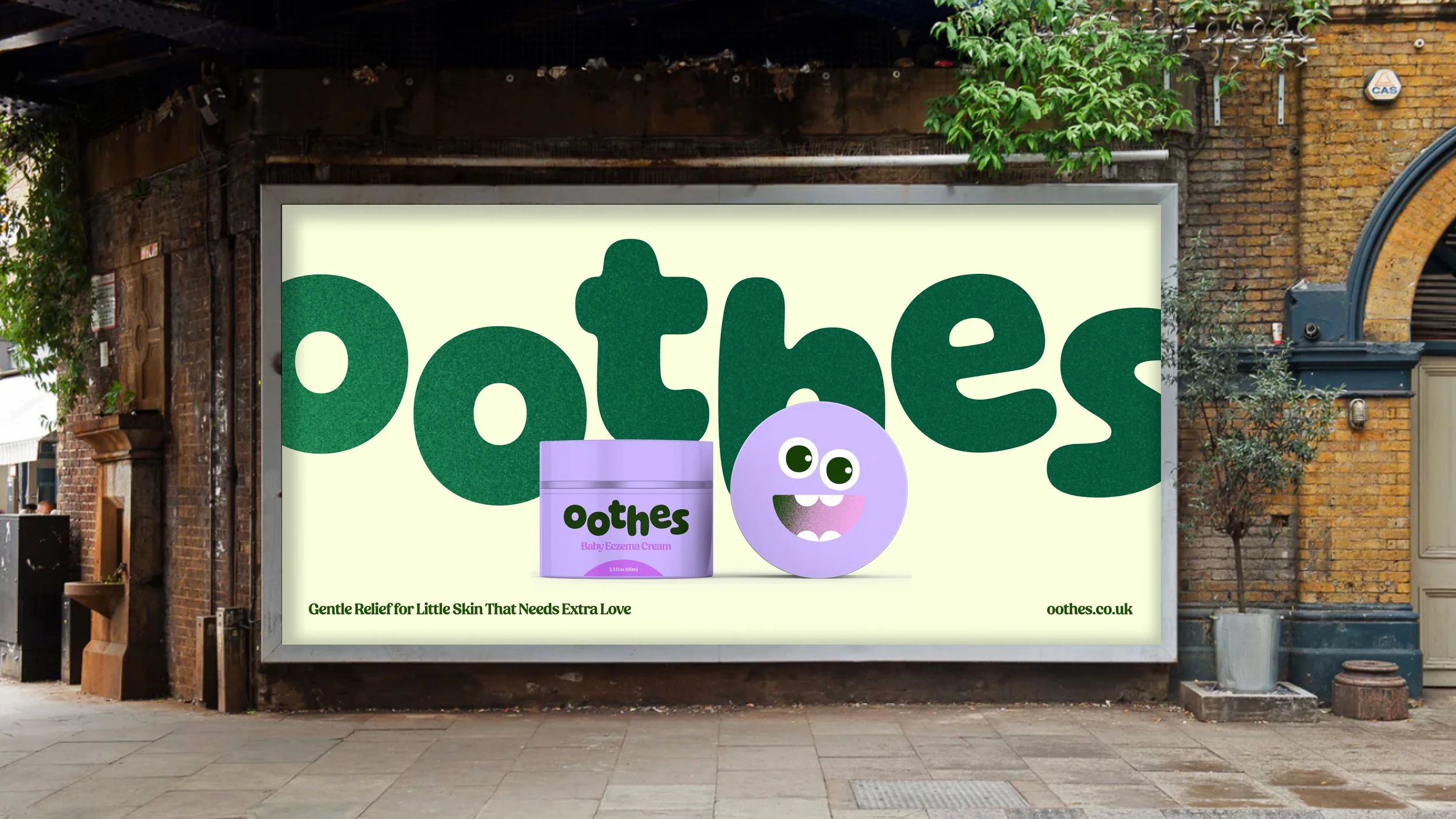
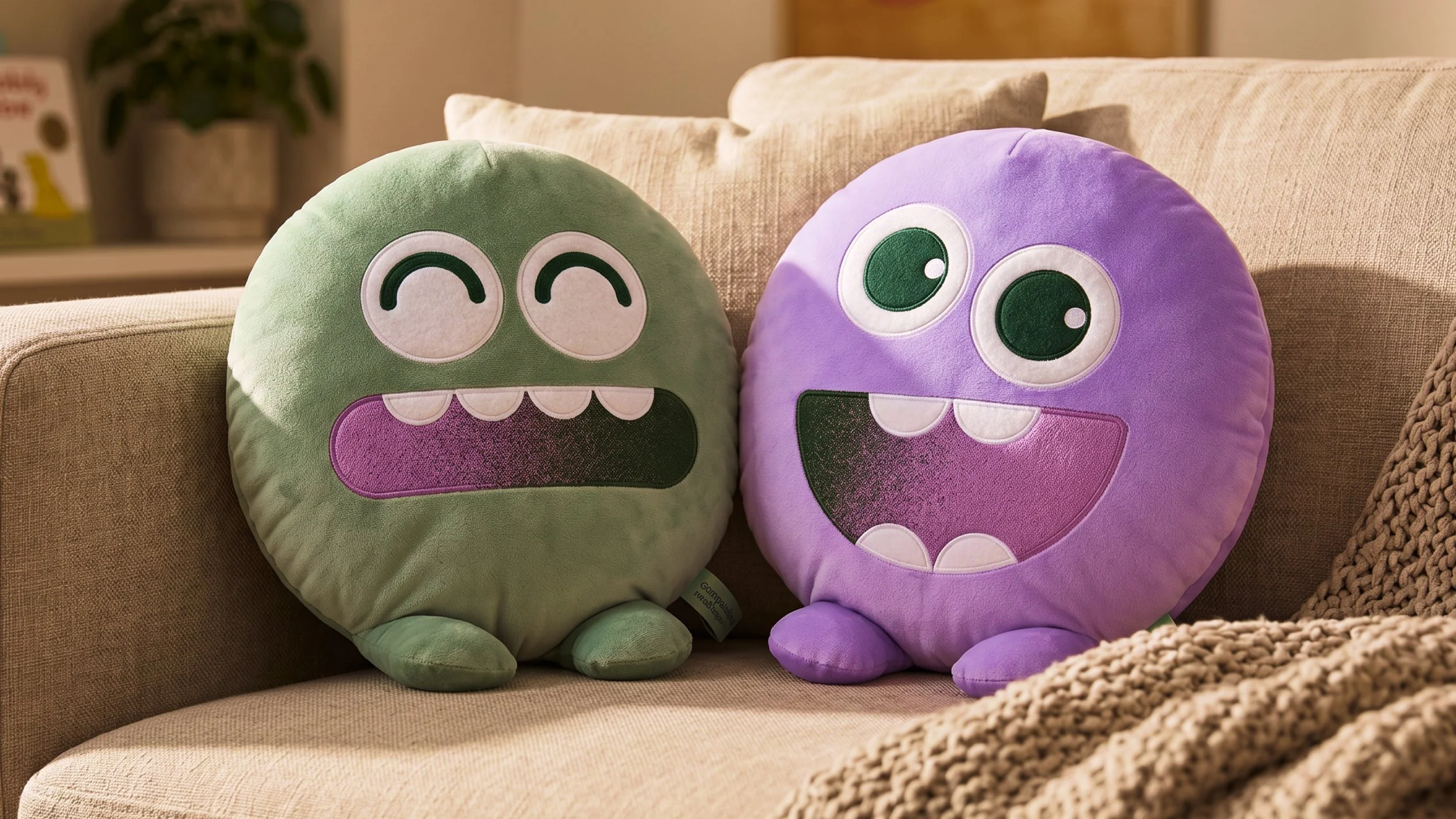
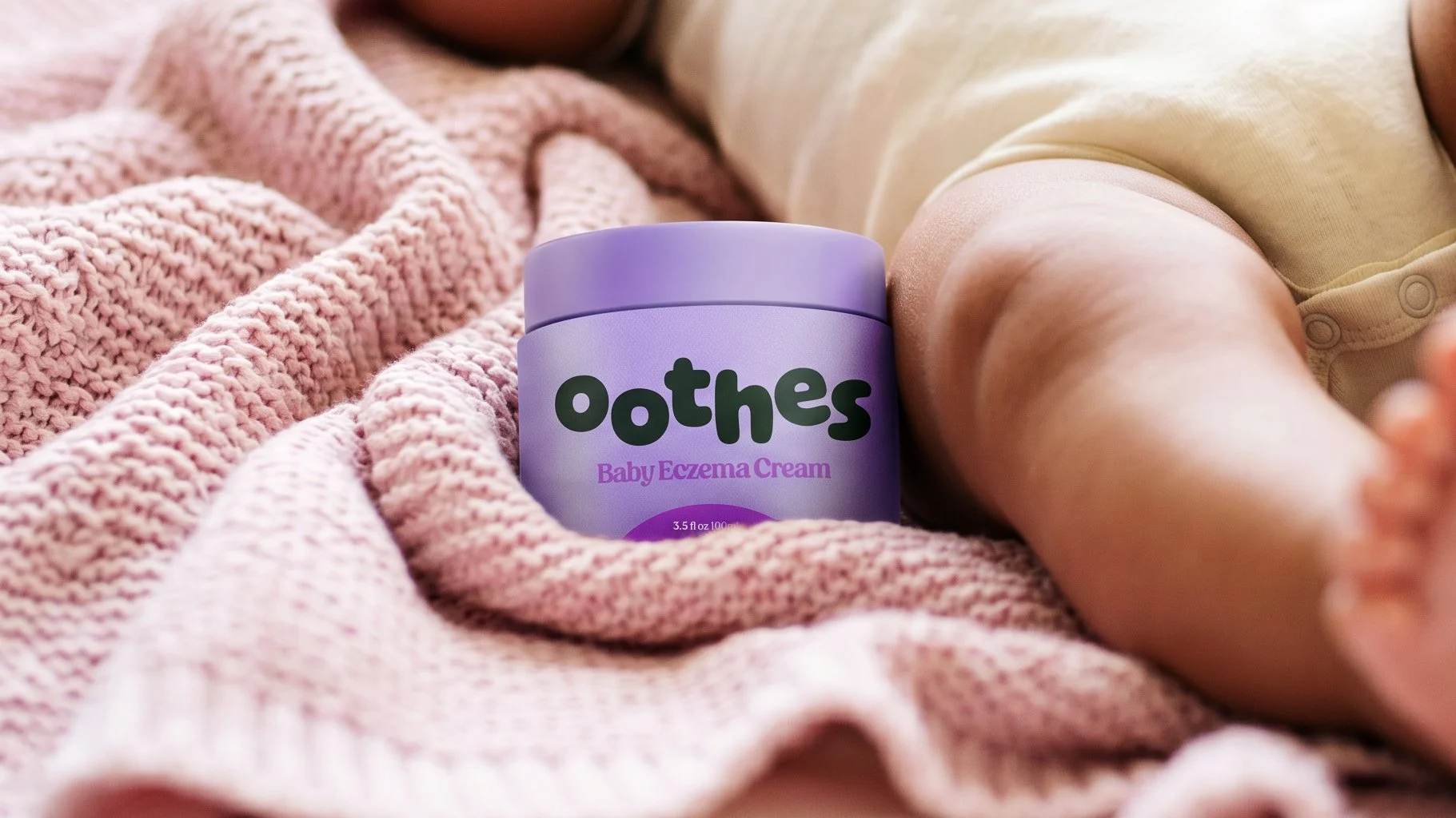
A playful and engaging brand world was created to bring joy to children’s skincare routines while maintaining a sense of trust and reassurance for parents.
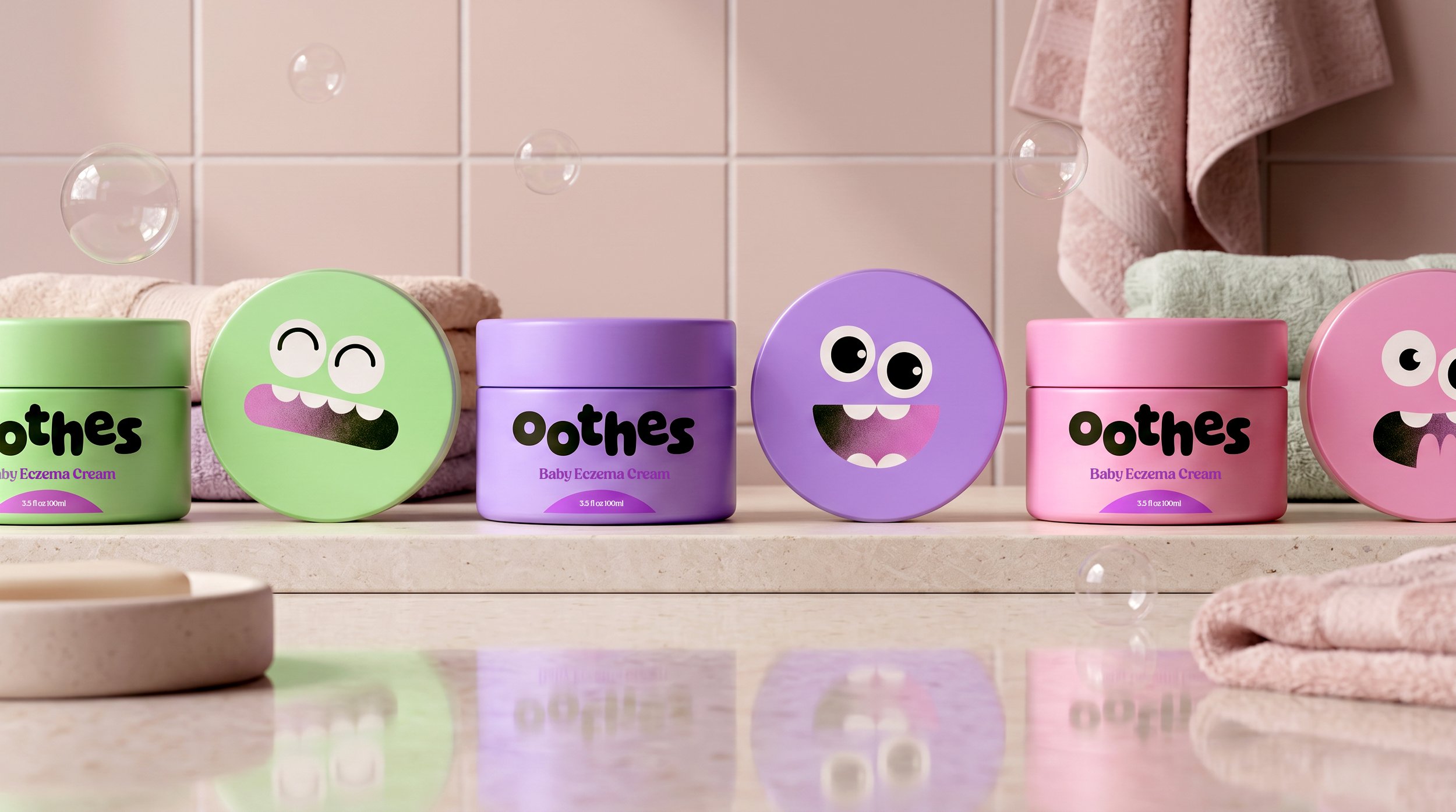
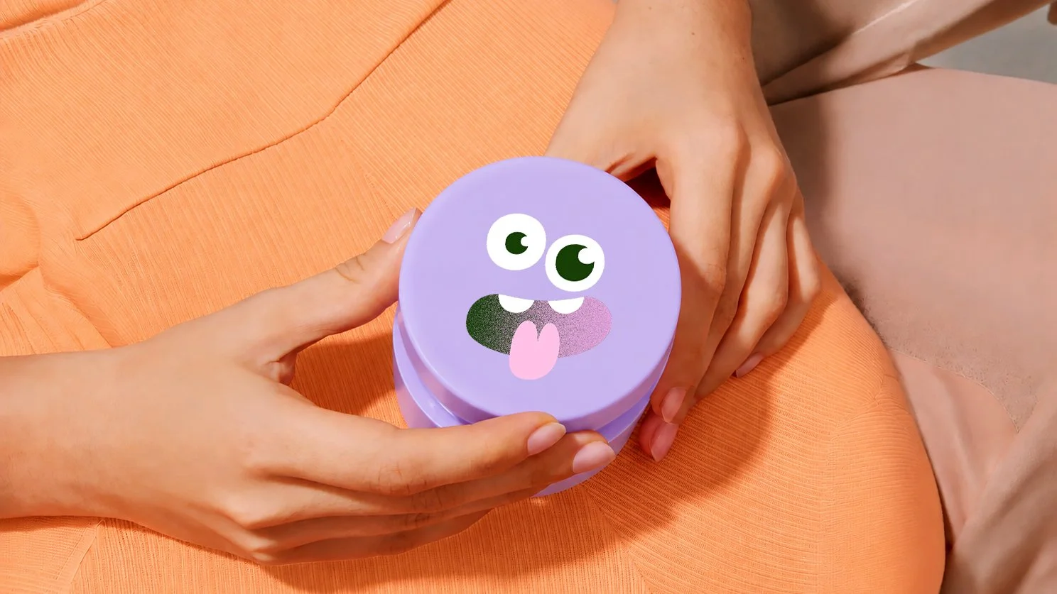
The identity combines a soft, friendly, and colourful visual language with packaging designed to encourage creativity and self-expression. Each product includes a set of stickers, allowing children to personalise their packaging and make it uniquely their own.
Through thoughtful design and playful interactions, Oothes transforms everyday skincare into a more enjoyable and memorable experience for kids.