C L I E N T
Water Direct
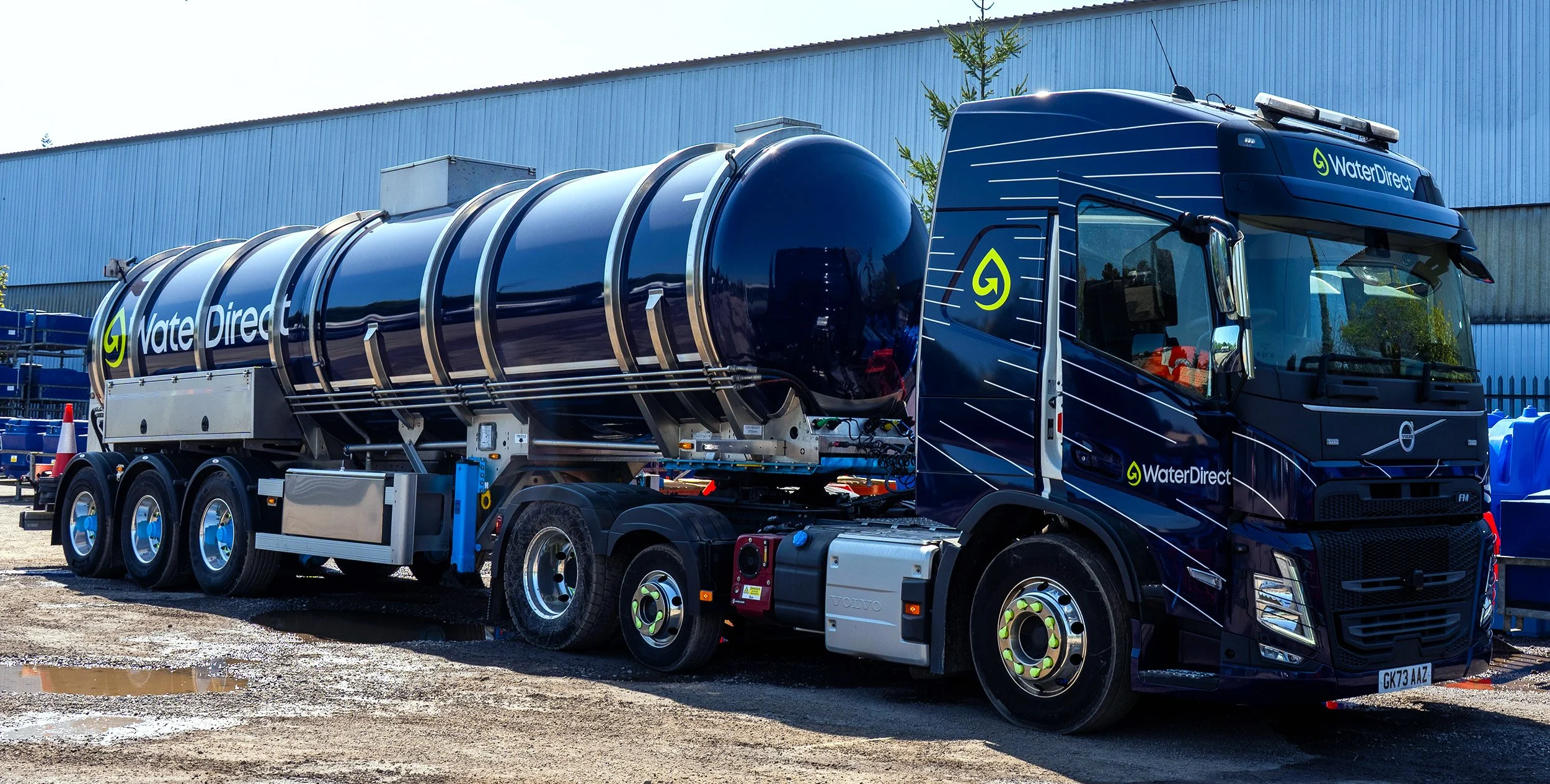
→ Brand Identity
→ Truck Design
→ Website by Kota
T H E C H A L L E N G E
Water Direct wasn’t just looking for a refreshed logo—they needed a brand that reflected their ambition to build the UK’s alternative water network. In a market where suppliers often look and sound the same, the challenge was to create an identity that felt modern, digital-first, and unmistakably theirs.
The brief was to reposition Water Direct as more than a reactive service provider; they’re a strategic partner delivering planned, emergency, and long-term water solutions across the country. We set out to craft a brand that felt confident, responsive, and future-ready—one that could stand out in a crowded infrastructure space while staying grounded in trust and clarity
T H E S O L U T I O N
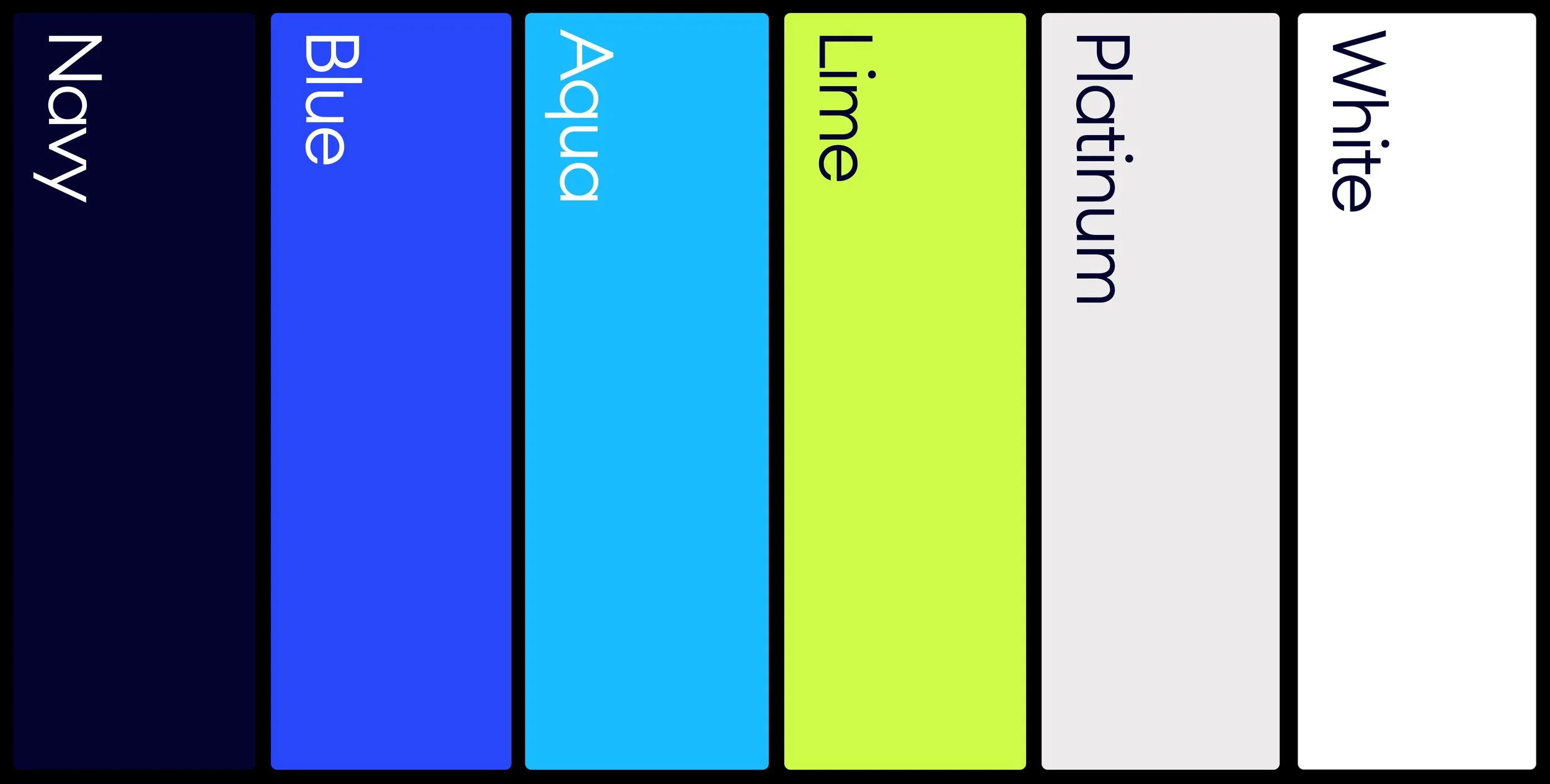
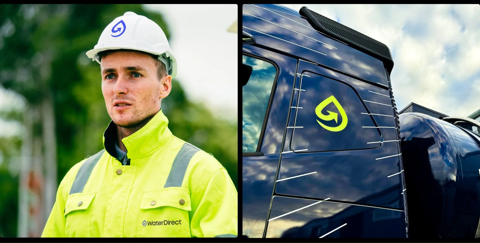
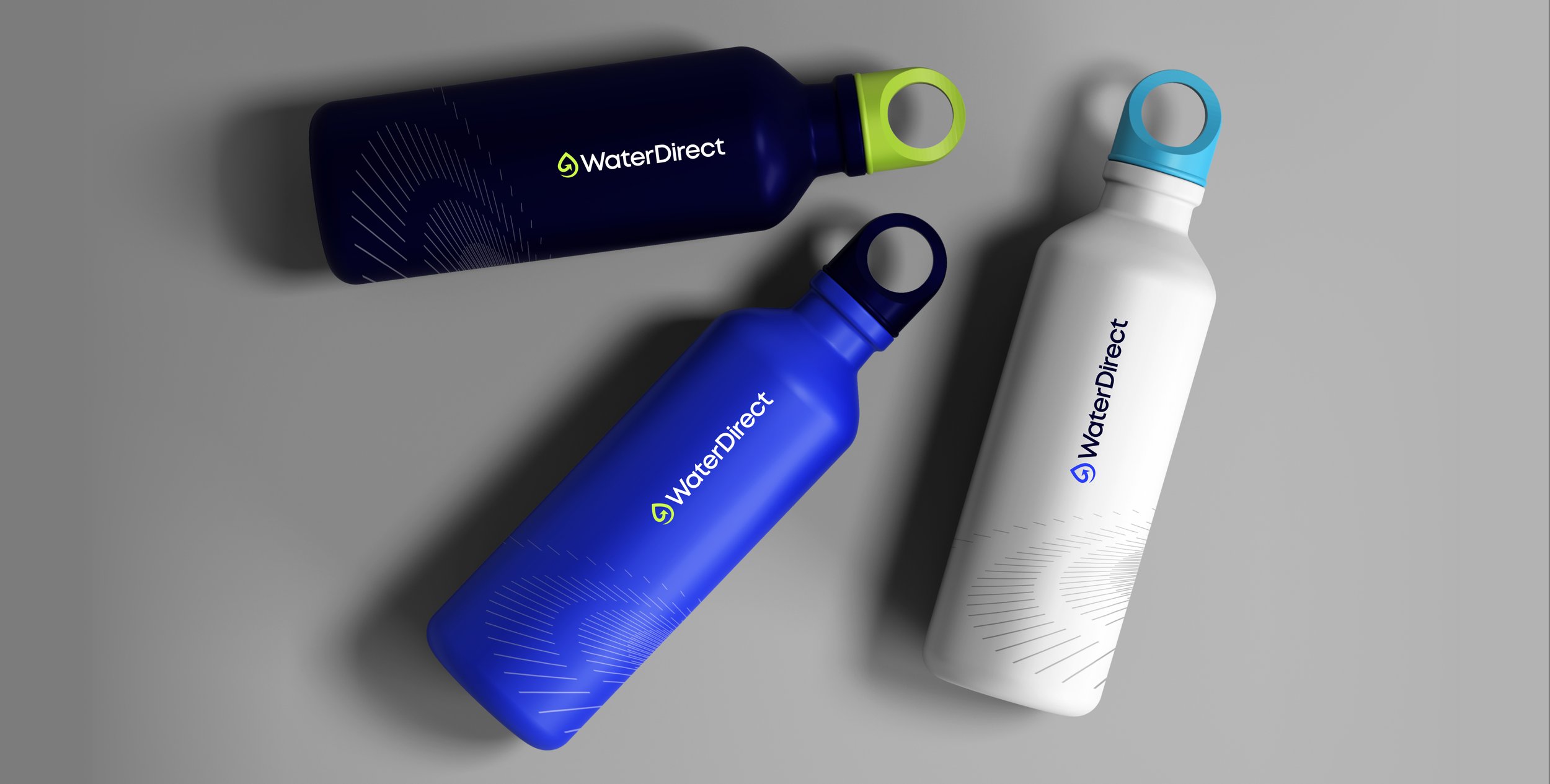
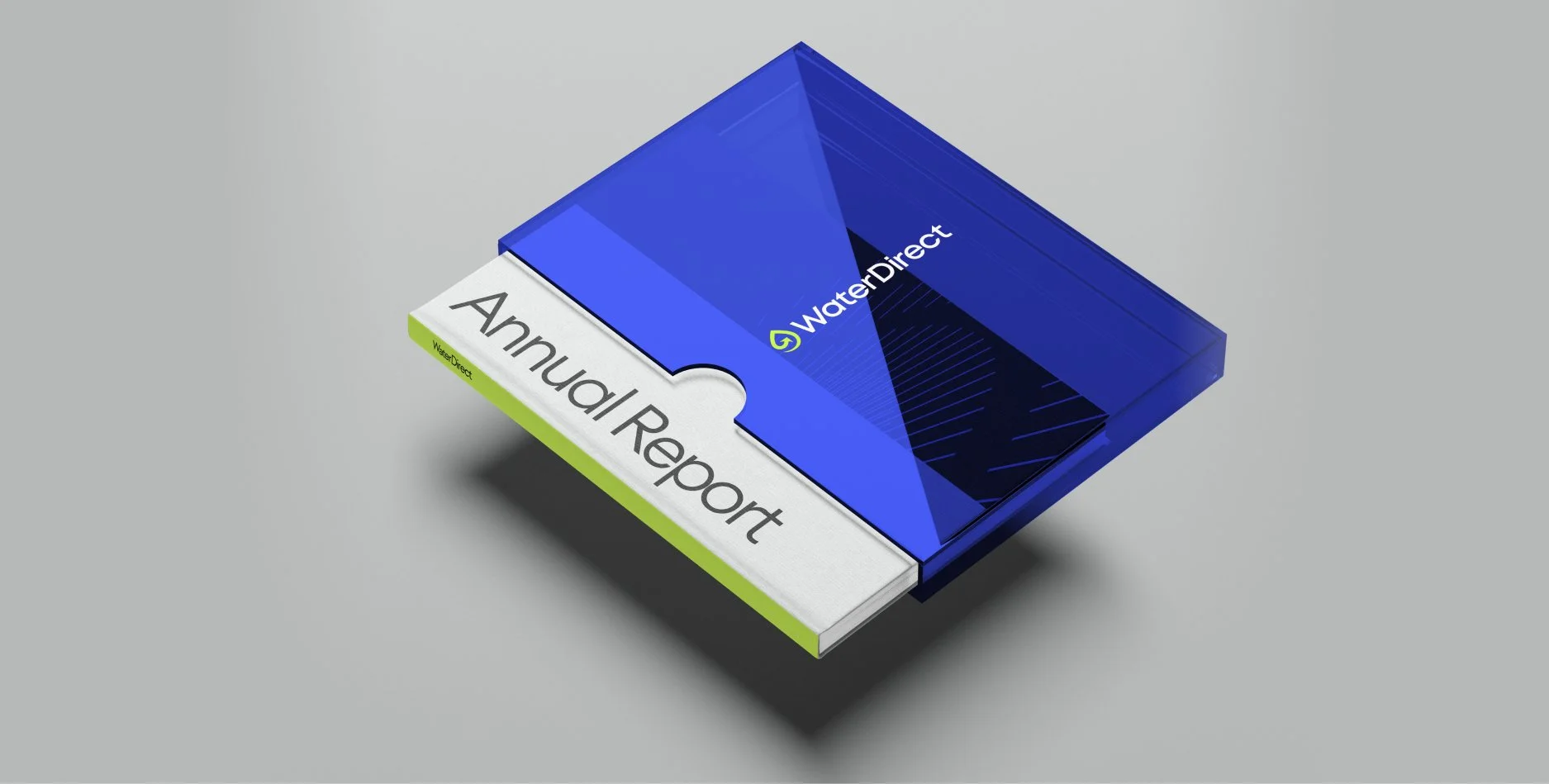
A striking new palette centred on navy and lime brings energy and standout, while the refreshed logo delivers a more modern, agile feel. At the heart of the identity is a dynamic supergraphic—‘the ripple’—designed to reflect movement, connectivity, and growth. Together, these elements signal a brand ready to lead the next phase of the UK’s water infrastructure.